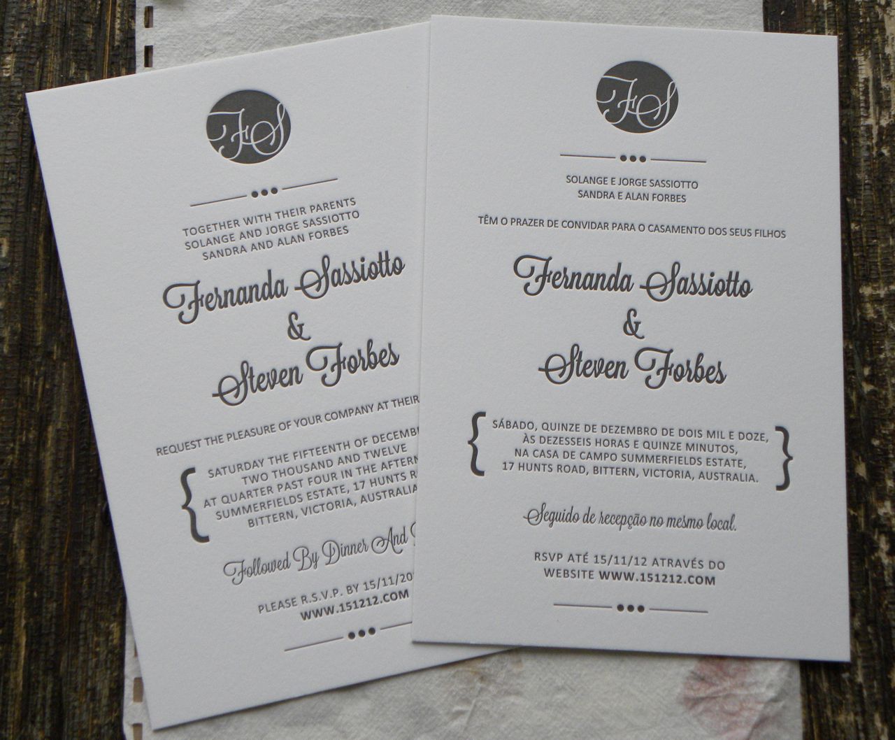
Wedding invitation designs that feature beautiful typography (in any language!) are just made for letterpress. Fernanda contacted us last year and asked if it were possible for us to print one invite in English and one in Portuguese for her upcoming wedding. Of course we are more than happy to print invitations in any language!
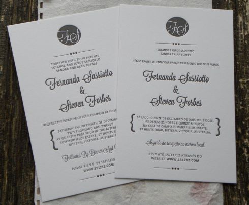
Her fiance Steve sent us a layout with a monogram that we modified slightly to be more letterpress friendly and got busy printing right away. The ink colour we used is a slightly shimmery Pantone Black 6U that looked perfect on Crane’s Lettra pearl white. To add a bit more oomph to the piece we bumped up the stock to double-thick 220lb!
Leave a comment | tags: cotton paper, Crane's Lettra, letterpress, letterpress printing, letterpress wedding invitation, Paper, Portuguese language, we do printing, we do printing letterpress, Wedding invitation | posted in Wedding Stationery
Back in December, WDP was invited by the talented Ottawa wedding planner Lynn Lee http://weddingsunveiled.ca to design stationery for a style shoot she was organizing. We were so lucky to be among many talented wedding vendors that participated in the beautiful shoot full of flowers and chocolate!
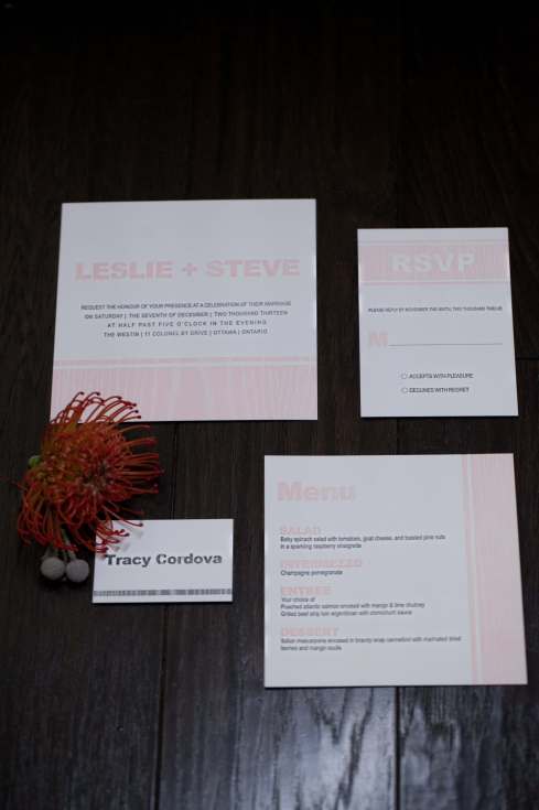
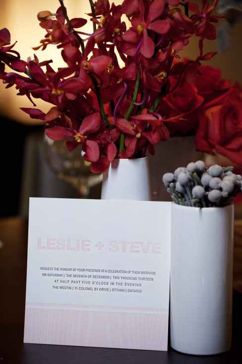
If you were browsing wedding sites on Valentine’s Day you might have seen our pink and grey woodgrain letterpress suite as part of this featured blog post on WedLuxe Style File: In Full Bloom. If not, please check it out now, and all of the amazing vendors that contributed!
Stunning photography by Barbara Ann Studios http://barbara-ann-studios.com
Leave a comment | tags: canada letterpress, Crane's Lettra, letterpress, letterpress printing, letterpress wedding invitation, Stationery, we do printing letterpress, Wedding, Wedding invitation, WedLuxe | posted in Wedding Stationery
Hey everyone, I know it’s been forever since we’ve blogged last and yes we are still alive! 🙂 There has been a lot of printing and designing keeping us busy so we’ll have a few posts coming up in the next couple of weeks showcasing the great work we’ve had the privilege of doing over the last couple of months. Today, a project that was a real treat to print (mmm donuts) are these awesome business cards for Toronto based company Pink Donut Visuals. 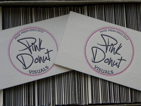
Some logos are just perfection when letterpress printed and this one certainly is! We used Pantones 2375 & 2756 on Crane’s Lettra 220lb cotton stock and then to make the cards even better, edge-painted them in matching blue. 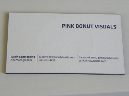
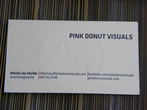
Check out Pink Donut’s Facebook page for all kinds of info on their video production services http://www.facebook.com/pinkdonutvisuals and their Vimeo page for examples of their work http://vimeo.com/pinkdonutvisuals (they do weddings!!)
WDP also has a new website in the works (forgive the lack of pages to browse) but if you want information on our letterpress services there is a contact form on our homepage http://www.wedoprinting.net
3 Comments | tags: Business card, canada letterpress, cotton stock, Crane's Lettra, Edge Paint, letterpress, Letterpress Business Card, letterpress printing, lettra, Pink Donut, we do printing, we do printing letterpress | posted in Business Cards
Still need to pick up greeting cards to wish your favourite friends and family a Happy Holiday Season? You still have time to check out our letterpress cards in our ETSY store! http://www.etsy.com/shop/wedoprinting


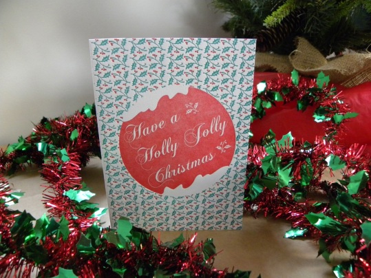
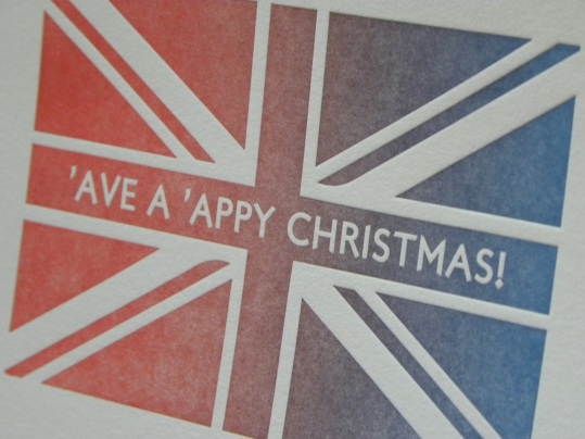
All cards are printed one at a time on Crane’s Lettra 100% cotton paper on our 1950s Heidelberg Windmill letterpress.
Leave a comment | tags: canada letterpress, Christmas Card, England, graphic design, Greeting card, Happy Holidays, letterpress, letterpress cards, Printing, Stationery, we do printing | posted in Social Stationery
Of all the printing we’ve done on our Windmill, these greeting cards from Australia are definitely the cutest! Jenny Mac, the creative mind behind tj stationery & gifts asked us to letterpress print these 6 unique square cards on Crane’s Lettra 100% cotton paper. Each 15cm x 15cm card is lined with an inner sheet and paired with a Kraft envelope. The cards are available for sale on her website and if you like & share her Facebook Page http://www.facebook.com/helloteejayco before Dec. 10 you will be entered in a draw to win a set of 6 cards!

Polymer printing plate ready for the press!

Rainy Card waiting for a trim.
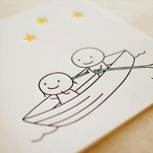
Boating under the stars… 🙂
Go buy some cards!! tj stationery & gifts
1 Comment | tags: Australia, canadian letterpress, graphic design, Greeting card, jenny mac, letterpress, letterpress printing, letterpress stationery, Stationery, we do printing | posted in Social Stationery
Unique businesses deserve unique business cards and we’ve got 2 examples to show you today. Both of these cards were letterpress printed for local customers (staying 100 mile-yay!) on creamy Lettra pearl white cotton paper for a classic antique look.

The Old 4th is a new organic brewery in the area; organic beer-can it get any better?? You have to see the awesome pics of their hops harvest on their Facebook page http://www.facebook.com/Old4thBrewingCompany Their logo was also designed by local designer Erica Taylor, check out her artwork here: http://www.ericataylorart.com

For Dr. Wheatcroft’s Organ Consulting card we also opted for a vertical layout with Copperplate font and a medieval looking organ to offer a hint as to his line of work. The details in the graphic came out beautifully on the letterpress. There is a ton of information about his restoration projects on the website here: http://www.organconsulting.ca
A one-of-a-kind business having a ho-hum business card will not get noticed, don’t let that happen to you! Give us a shout for a quote and get your business noticed!
And if you only need 100 1 colour cards, it’s $95.00!
Leave a comment | tags: Bruce Wheatcroft, Business card, canada letterpress, Design, letterpress, Letterpress Business Card, letterpress business stationery, Old 4th, Printing, we do printing | posted in Business Cards, Letterpress Deals
We get asked all the time if we can print designs you send us. Of course we can! In fact, we’d love to! All pieces in this fabulous suite were designed by Ottawa bride Tarah Hunter.

There are so many options to bring your suite up a notch. Printing on the back of the invite, rounding corners, mixing fonts, patterns printed on the envelopes; these are all options Tarah chose for her suite and they all worked perfectly together! The whole suite was printed on Crane’s Lettra 220lb paper except the menu which was done on 110lb.

A few tips if you plan on designing your own wedding suite for letterpress: Keep it simple-1 or 2 ink colours works best, line art only-no screens please, use a Vector based design program such as Adobe Illustrator, and no hairlines or teensy fonts please! 🙂
If you are interested in having your designs printed by us, just shoot us a message and we would be more than happy to answer any of your questions!
Leave a comment | tags: canada letterpress, cotton paper, Design, letterpress printing, Printing, Stationery, we do printing, we do printing letterpress, Wedding invitation, wedding stationery | posted in Wedding Stationery
There is nothing a designer or printer loves more than clients who know exactly what they want and Alexis and Stephanie were an absolute dream to work with! Alexis asked for a simple, text only design with edge-painting and printed envelopes for their wedding invitation suite. Perfect for our letterpress! We used a monogram Alexis designed himself and picked out a couple great fonts and Pantone colours to match the style. Edge-painting the invite in matching yellow completed the look.


Leave a comment | tags: canadian letterpress, cotton paper, Edge Paint, graphic design, letterpress, letterpress wedding invitation, Printing, Stationery and Paper, we do printing letterpress, Wedding invitation | posted in Wedding Stationery
Hey everyone, it’s been awhile since we’ve updated our blog, but it’s only because we’ve been so busy! Today I have a few pics of 3 different business cards we printed for clients in the last month, all 3 are printed on Crane’s Lettra 220lb cotton paper and feature our fave customization-edge-painting.
This first card designed by Brytani Bedard at 10Count is printed double-sided with basic black ink and edge-painted in the same black for a classic look.

This second card designed by Victor Paszkiewicz at Mebius is printed single-sided in Pantone Cool Grey 11 and edge-painted in the same matching grey.

The third card designed by Des Hildebrand at Paper Airplanes for Kendra Redekop Design was printed in 2 ink colours-Pantones 7712 & Cool Grey 11 and edge-painted to match Pantone 7712.

A business card needs to get the attention and keep the attention of the person it is handed to, and these cards sure do that! Upgrade your business card to letterpress, just send us a message for a quote!
2 Comments | tags: 10Count, Business card, Edge Painting, letterpress, Letterpress Business Card, Mebius, Paper Airplanes, Printing, Stationery and Paper, we do printing | posted in Business Cards
I am frequently asked about the steps We Do Printing takes to minimize our impact to the environment. There are many print companies out there that are claiming to be completely green print shops-but this is impossible. Printing, no matter what kind of printing you do, is never going to be completely green but there many choices we can make to ensure it is as eco-friendly as possible.
So here are a few things WDP does:
1. Paper: Whenever possible we use recycled stock, especially for our offset printing. Our letterpress paper is either tree-free cotton, fast growing bamboo or local paper made from a variety of industry waste like denim off-cuts and flax straw. Any scrap paper is reused or recycled. One of the main benefits of letterpress printing is that there is not nearly as much paper waste with each press run as there is with offset printing.
2. Ink: The majority of our inks are soy based and rubber based. Soy ink was thought for a long time to be greener than rubber ink but honestly if you gave them a score-they would be tied. We find that the rubber based inks print nicer so we find ourselves using rubber ink more often than soy ink. Most ink colours are mixed by hand so we don’t have to order in a full tin each time we have a job to do. We also use some oil based inks that were rescued from heading to the landfill after a local print shop went out of business. Reduce is the first R after all!
3. Packaging: The majority of our customers are not local so packaging is a major concern for us. Custom packaging for our printed goods is something we did think about but it really does seem wasteful. So, all of our business card boxes are plain and made from recycled materials, and for shipping, we re-use boxes, bubble wrap and packing from supply orders whenever possible.

An example of how we packaged a wedding invitation suite for shipment. No wasteful custom packaging here!
There are many other choices we’ve made such as having our shop on our property so we don’t need to travel to work everyday, buying in bulk to reduce shipments, using energy efficient lights in our shop and taking donated scrap cloth to use in clean-up. We do consider Mother Earth Everyday, not just on Earth Day.

Leave a comment | tags: Business, canadian letterpress, cotton paper, Earth Day, ink, letterpress printing, Offset printing, Printing, Recycling, Stationery and Paper, we do printing | posted in The Process